Actually I have decided long time ago to have a yellow door. Yes, and that's amarillo ;-) but what yellow and what combination? I always think that yellow goes very well with dark grey, but how dark am I comfortable with? Should I have a dark grey house and then off white trim around the roof and eave? It seems natural since I have a very white foam roof, in that case, the whole upper part of the house will be like a "cloud." The house color will be dark and then a splash of yellow to give a focal point. Before going to the paint store and look at swatches, I did a few Photoshop mark ups to look at the effect.
 |
| 1st photoshop attempt |
Of course the front of the house doesn't look like that as the glass blocks had been covered up. But more or less this was the color scheme I started out with. Somehow, I'm a bit nervous with having a very dark main body of the house. Will the house get too hot? I just know that if it's not dark enough it will look neither here nor there. But if it's too dark, am I running the risk of having a big black box? I think a very dark house looks very nice if it's surrounded by mature vegetation; and if the entrance is not with a very high ceiling. I'm just not too comfortable with having this house painted all dark. I am also a bit bothered by the white outline.
So how about the alternative? Flip the dark and the light color and maybe orange instead of yellow? Actually I have tried out many other combinations, but here is one of better ones.
 |
| 2nd attempt |
Actually I like this less stark contrast better, but somehow the monotonous tone of the very wide garage and side gate looks very "boring." There are absolutely no other elements like windows, trimmings, level changes to offset the monotony! There's also one other issue, somehow Jessica doesn't like the orange door, not sure why, but I guess I'll stick with yellow than...which was my original plan.
Then one day on October 22 I drove past a modern house, not Eichler and it has different siding materials. It's a mixture of off white wood color, dark wood and then silver tin siding. The combination looks harmonious and interesting. And then I have an epiphany! I will use color to simulate the effect of different siding! This will solve the monotony issue that has been bothering me.
 |
| Dark eave, light putty main color, silver grey front and side gate. |
Light putty is still the main color of the whole house, but in the front it's intercepted by a silver grey color which also matches better with a yellow door than the light putty. Voila. This is it, now the challenge is to find the real life right color.
Again after numerous trips to Benjamin Moore and Orchard Supply Hardware. Going through stacks of color fan deck and buying those awfully expensive cans of sample paint and wasting almost the whole can. Why do they have to come in a pint (16 oz)? Seriously a 4 oz can is more than sufficient to try it out... Ahhh such a waste, but without sampling it's just too risky. Finally this is what I gave to the painters:
Eaves and all beams: Gray Pinstripe 1588 – Soft Gloss FinishDoors (front, back patio and garage door): Sunflower 2019-30 – Soft Gloss FinishFront facing entrance (as in photo), side gate and chimney: Silent Night 1613 – Flat FinishMain House: Tapestry Beige OC-32 – Flat Finish
Finally on Tuesday October 30th, Enrique, Julio y Juan came back to work on the exterior. They are each painting one color and by afternoon I can see glimpse of different color in working. Wait!! The Gray Pinstripe is way too light, not dark enough. Why? It should be dark enough... we sampled it... I saw it next to the other color... but after applying it on a big space, it just doesn't give enough contrast!!! But they already bought all the paint, this needs to be fixed. After talking to Enrique he is willing to stop the work on the dark grey and wait for me to get the new paint. Once again, back to the paint store to look for darker grey, much darker grey this time as the last one apparently is not dark enough. Finally I decided on Temptation 1609. Another 3 hours of running around, another 3 gallon of paint, another 3 days of painting, the exterior is done by Friday November 2.
This morning I went to take pictures. This is my house at 8:30am:
 |
| Sun is shining right in the front to see the color correctly. |
 |
| Backyard gives a better idea. |
 |
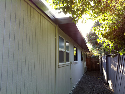
| Side yard with the new non-rotten siding. |
 |
| You can see slightly better from a different angle. |
At 11:00am:
And again in 3 in the afternoon:
These pictures were taken from the iPhone and not in the best lighting and condition. Hopefully I will have better pictures later when the project is done. We are inching towards that now.


No comments:
Post a Comment